The J.M. Smucker Co.’s first packaging refresh in decades reflects how legacy food brands are balancing nostalgia with modern visibility, adapting to changing retail environments and consumer habits.
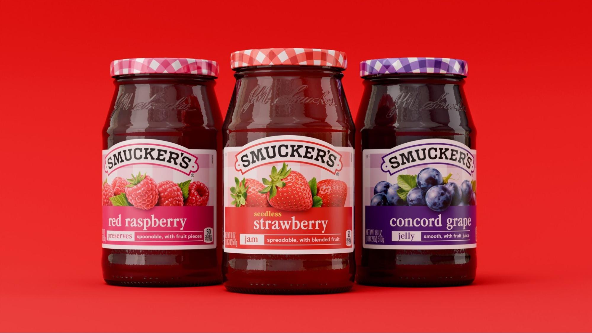
The J.M. Smucker Co. has unveiled a redesigned look for its Smucker’s fruit spreads, marking the brand’s first major packaging update in nearly 30 years. While the product itself remains unchanged, the visual shift signals how even long-established pantry staples are being reconsidered in response to evolving consumer expectations.
At the center of the redesign is the brand’s familiar gingham pattern, a defining visual element since the 1990s. Rather than replacing it, the company has expanded its presence, placing it more prominently on both the lid and label, while introducing brighter colors and more pronounced fruit imagery to distinguish flavors.
This approach reflects a broader trend in food branding, where companies seek to modernize without losing the recognition built over generations. Nostalgia remains a powerful tool, but it is increasingly paired with design updates that improve clarity and stand out in crowded retail environments.
The changes also speak to how shopping behaviors have shifted. With more consumers making quicker decisions in stores or browsing online thumbnails, packaging must communicate flavor and identity at a glance. Distinct color coding and larger imagery can help simplify that process, particularly for products with multiple varieties.
At the same time, the redesign acknowledges the growing role of presentation in everyday consumption. Items like jams and spreads are no longer confined to breakfast tables; they appear in casual entertaining settings and social media-driven food culture, where visual appeal can influence perception as much as taste.
By keeping the recipe consistent, the company avoids altering a product that has built long-term trust, focusing instead on how it is perceived externally. This distinction highlights how, for many established brands, innovation is less about reformulation and more about repositioning within contemporary lifestyles.
The Smucker’s update illustrates how legacy brands navigate continuity and change. Maintaining recognizable elements while refining visual identity allows them to remain relevant without alienating loyal consumers.
As competition intensifies across grocery aisles, even small adjustments in packaging can carry broader significance. In this case, the redesign suggests that heritage alone is no longer enough—brands must also ensure they are legible, adaptable, and aligned with how people shop and experience food today.